 All work
Neocare Associates — Brand Identity
Care, made
visibly human.
A warm and memorable identity that helps a specialized newborn-care practice feel credible, approachable, and reassuring from the first interaction.
- Focus
- Brand identity
- System
- Logo · Color · Typography · Illustration
- Expression
- Digital · Print · Environmental
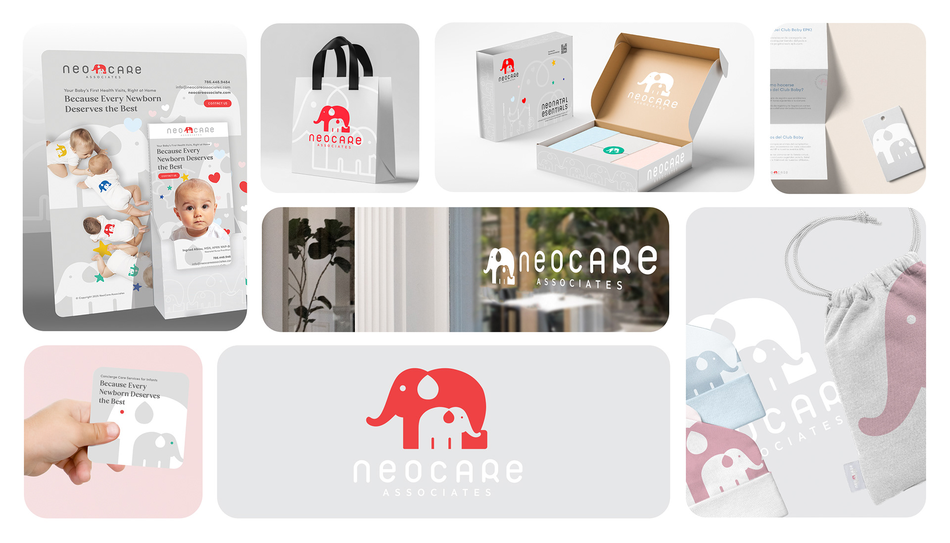
The idea
A symbol built
around connection.
The parent-and-child elephant creates an immediate expression of protection, trust, and closeness. Paired with a distinctive lowercase wordmark, it gives Neocare an ownable signature that feels gentle without losing professional clarity.
The identity system
Recognizable mark
A compact symbol that remains clear across signage, digital interfaces, printed communications, and small branded details.
Reassuring voice
Rounded typography and generous space soften the clinical context while keeping information direct and easy to navigate.
Flexible palette
A calm neutral foundation is energized by red, blue, green, yellow, and soft pastel accents—creating variety within a consistent family.
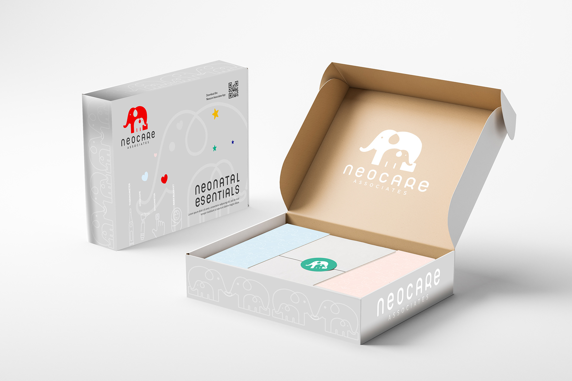
From identity to experience
One visual language.
Every point of care.
The system extends naturally into parent communications, digital materials, office signage, apparel, and select care applications. Each touchpoint reinforces the same promise: thoughtful expertise delivered with warmth.
View the original project