 All work
Equity Prime Mortgage — Rebrand
A stronger foundation.
A clearer way forward.
A complete brand overhaul designed to make EPM more recognizable, coherent, and adaptable—from the central mark to the spaces and materials where the brand lives.
- Scope
- Strategy · Identity · Guidelines
- Applications
- Workplace · Events · Merchandise
- Reported result
- 60% increase in post-launch brand recognition
The transformation
One identity.
Built around purpose.
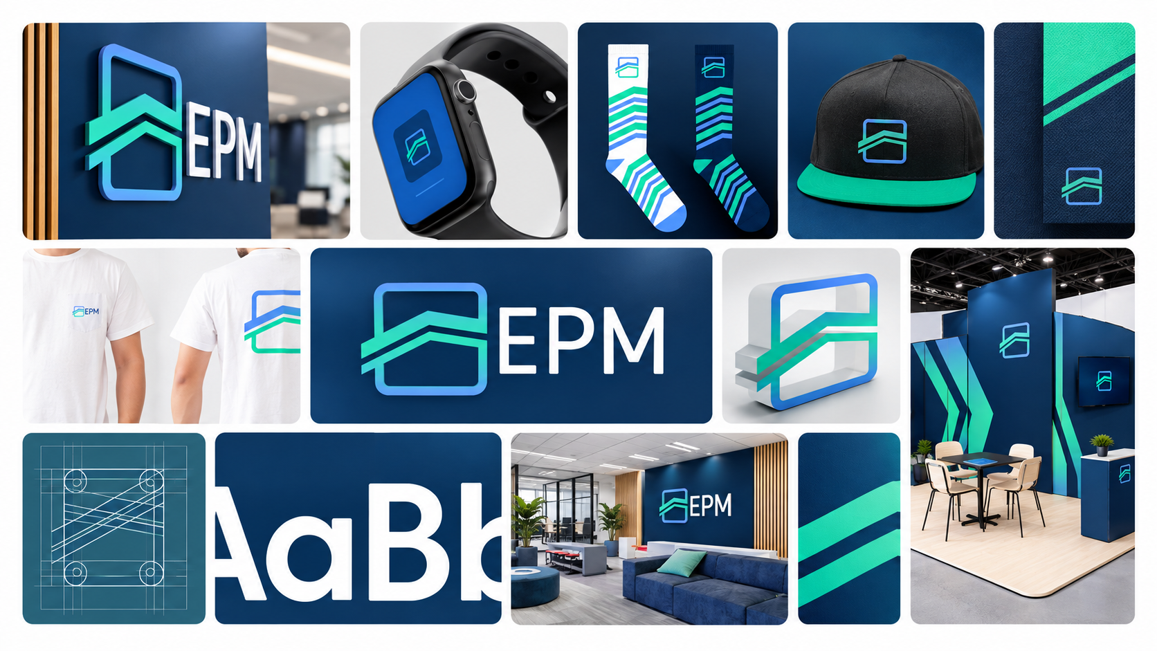
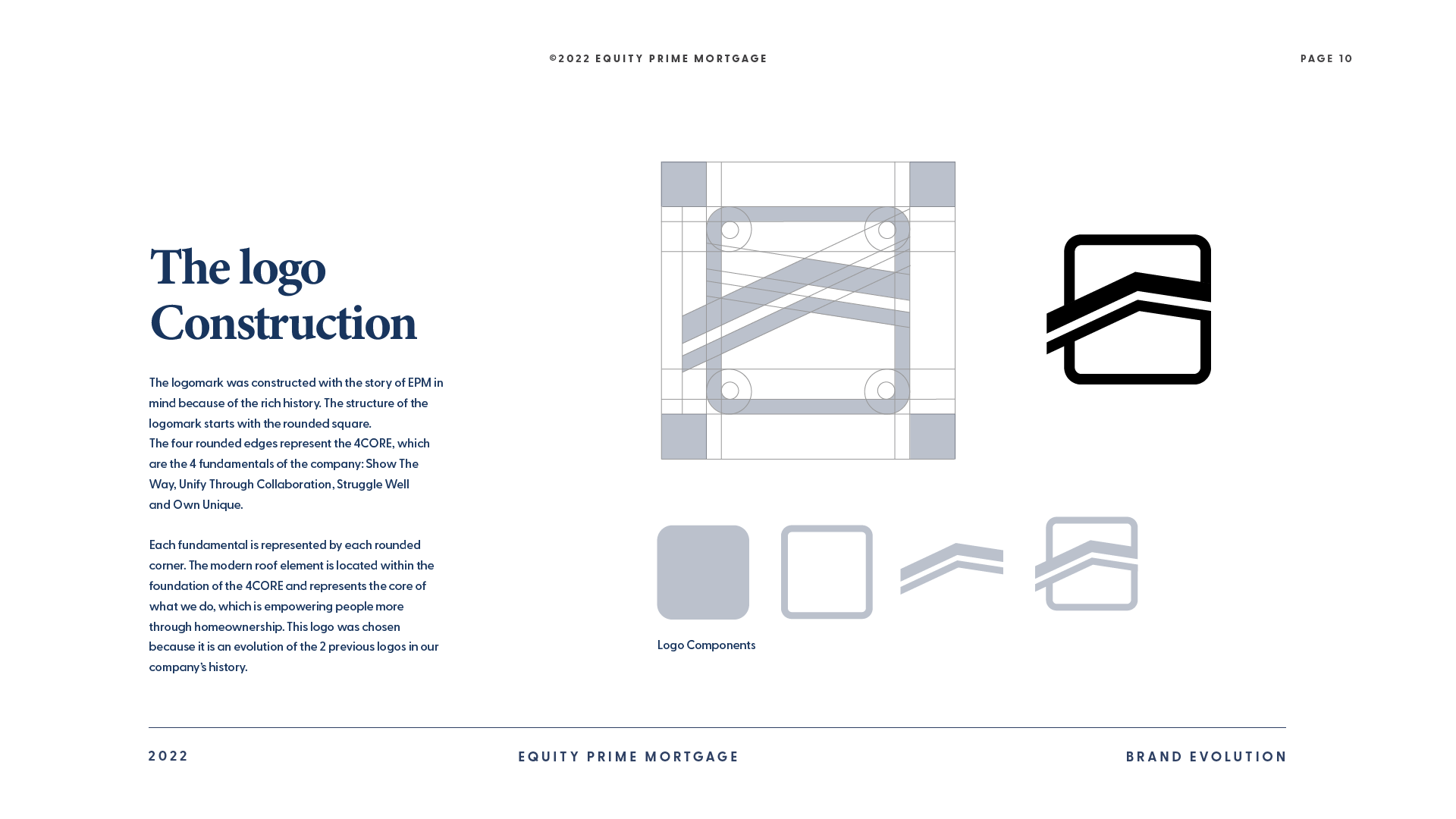
The redesign translated EPM’s history and values into a modern visual system. A rounded frame establishes stability, while the roofline at the center connects the identity to EPM’s role in empowering people through homeownership.
The system
Strategic foundation
The mark evolves EPM’s previous identities while giving the company a more focused and contemporary expression.
Four core values
The four rounded corners reference EPM’s principles: Show the Way, Unify Through Collaboration, Struggle Well, and Own Unique.
Flexible expression
Color, typography, and graphic elements extend consistently across digital, environmental, event, and employee-facing applications.
The result
60%Greater brand recognition.
Post-launch surveys reported a 60% increase in brand recognition, connecting a more distinctive identity to a clearer presence in the market.
View the original project